

Summary
This article explores the significance of visualizing passing sonars in football, providing valuable insights into player performance and team dynamics. Key Points:
- Utilize data preprocessing techniques like cleaning and normalization to improve the quality of passing sonar visualizations.
- Implement advanced visualization methods such as heatmaps and trajectory analysis to effectively display player movement patterns and passing decisions.
- Leverage Python libraries, including Matplotlib, Seaborn, and Plotly, for creating dynamic visualizations that are both interactive and customizable.

In this article, I will guide you through the process of creating a passing sonar visualization, similar to the one shown above. We will utilize free event data provided by StatsBomb, which is an excellent source for high-quality football data at no cost. At the end of this post, you'll find a Python function that you can easily copy and integrate into your own projects. For those who are already familiar with retrieving StatsBomb data using Python, feel free to skip ahead. Our first step is to import a specialized StatsBomb package. You can check out all the competitions for which they have made data available by using the code provided below.
Key Points Summary
- Passing sonars visualize the distribution and frequency of passes made by players on a football pitch.
- The radial bars in passing sonars represent pass angle frequency, showing how often players pass in different directions.
- These visualizations are useful for analyzing team performance and individual player contributions during matches.
- Passing sonars can provide insights into tactical approaches by revealing preferred passing angles and patterns.
- The concentric rings in these charts capture passes made at various distances from the passer, adding another layer of analysis.
- Tools like Python can be used to create detailed and informative passing sonar visualizations from statistical data.
Creating passing sonars not only brings a fresh perspective to understanding football but also helps fans appreciate the intricate strategies behind each game. It`s fascinating to see how visualization techniques can transform raw data into clear insights about player performances and team dynamics. Whether you`re a casual fan or an aspiring analyst, these tools open up a whole new way to engage with the sport we love.
Extended Comparison:| Visualization Tool | Key Features | Usage in Football Analysis | Advantages | Latest Trends |
|---|---|---|---|---|
| Matplotlib | Comprehensive plotting library, supports 2D graphics | Create basic passing sonars and other visualizations | Highly customizable, widely used in the community | Integration with machine learning for predictive analysis |
| Seaborn | Built on Matplotlib, enhanced aesthetics and simpler syntax | Visualize complex datasets including pass distributions effectively | Beautiful default styles improve presentation quality | Focus on statistical data visualizations is growing |
| Plotly | Interactive charts with zooming and tooltips features | Analyzing player movements and passing habits dynamically during matches | Engaging user experience through interactivity allows deeper insights | Real-time data streaming capabilities are becoming popular |
| Altair | Declarative statistical visualization framework based on Vega-Lite standards | Quickly create complex visualizations like passing sonars without extensive coding | Easy to use for rapid prototyping of visuals | Increased adoption of declarative approaches in data science workflows |
| Bokeh | Ideal for creating interactive plots that can be embedded into web applications | Used for real-time match analysis dashboards displaying player performance metrics | Supports large datasets efficiently with high performance rendering | Growing emphasis on cloud-based analytics tools |
from statsbombpy import sb sb.competitions()For our visualization, I selected the final of the 2008/2009 Champions League, in which Barcelona triumphed over Manchester United with a score of 2–0.
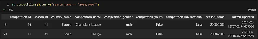
To obtain insights into the matches held in this competition, it's essential to focus on the competition_id and season_id found within this data frame, specifically numbers 16 and 41. With these identifiers in hand, we can delve into match-related information. The particular match we're interested in is identified by match_id 3750201.

Rather than retrieving a comprehensive data frame that includes all match statistics, we can simply concentrate on the pass-related information. This will be organized within a dedicated passes data frame.
MATCH_ID = 3750201 TEAM = 'Barcelona' passes = sb.events(match_id=MATCH_ID, split=True, flatten_attrs=False)["passes"] passes = passes[passes['team']==TEAM] df = passes[['pass', 'player']]Our central areas of interest revolve around the analysis of passing metrics and individual player contributions.

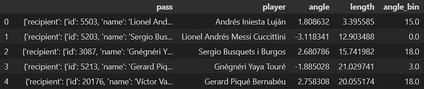
Let’s delve into what a specific cell in the passing column reveals.

The text includes a wealth of detailed information, from which we specifically need to derive the length and angle of passes.
df['angle'] = [df['pass'][i]['angle'] for i in df.index] df['length'] = [df['pass'][i]['length'] for i in df.index]Now we reach a critical point where essential data manipulation libraries, pandas and numpy, come into play. Each sonar representation consists of triangles that convey information about passes within specific angle ranges. Therefore, we need to categorize these pass angles into bins. Pandas offers a specialized function called 'cut' for this purpose. We will segment the angles into 20 distinct bins (angles are measured in radians). By setting the parameter 'labels' to False, the function will output only integer indicators for the bins, while setting 'include_lowest' to True ensures that the first interval includes its lower boundary.
import pandas as pd import numpy as np df['angle_bin'] = pd.cut( df['angle'], bins=np.linspace(-np.pi,np.pi,21), labels=False, include_lowest=True )Our existing data frame appears in this format:
We are prepared to calculate the mean pass distance and the frequency of passes for every athlete within specific segments. This vital data will be compiled into an updated data frame named sonar_df.
# average length sonar_df = df.groupby(["player", "angle_bin"], as_index=False) sonar_df = sonar_df.agg({"length": "mean"}) # counting passes for each angle bin pass_amt = df.groupby(['player', 'angle_bin']).size().to_frame(name = 'amount').reset_index() # concatenating the data sonar_df = pd.concat([sonar_df, pass_amt["amount"]], axis=1)
The analysis also considers the average positions where passes occurred. For this purpose, we should revisit the data frame that tracks each pass along with its coordinates. In this data frame, a column named 'location' holds lists consisting of x and y values related to the passes. We need to unpack these values prior to computing their averages.
# extracting coordinates passes["x"], passes["y"] = zip(*passes["location"]) average_location = passes.groupby('player').agg({'x': ['mean'], 'y': ['mean']}) average_location.columns = ['x', 'y'] sonar_df = sonar_df.merge(average_location, left_on="player", right_index=True)We successfully gathered all the essential data for our visualization into a single data frame.

There's one more detail to consider - what about the substitutions? For our analysis, we will focus exclusively on players who were part of the starting lineup. Thankfully, StatsBomb provides us with a straightforward way to access lineup information for each match as well.
lineups = sb.lineups(match_id=MATCH_ID)[TEAM] lineups['starter'] = [ lineups['positions'][i][0]['start_reason']=='Starting XI' if lineups['positions'][i]!=[] else None for i in range(len(lineups)) ] lineups = lineups[lineups["starter"]==True] startingXI =lineups['player_name'].to_list() sonar_df = sonar_df[sonar_df['player'].isin(startingXI)]To conclude, we can proceed with visualizing the pitch. This step will necessitate additional imports; mplsoccer is a specialized library designed to enhance football visualization in Python, providing easily accessible templates for football pitches. Additionally, we will utilize matplotlib's patches module to assist us in creating triangular segments for our sonar plots.
from mplsoccer import Pitch import matplotlib.pyplot as plt import matplotlib.patches as patAt first, let's just plot the pitch, embellishing it with some dark color.
fig ,ax = plt.subplots(figsize=(13, 8),constrained_layout=False, tight_layout=True) fig.set_facecolor('#0e1117') ax.patch.set_facecolor('#0e1117') pitch = Pitch(pitch_type='statsbomb', pitch_color='#0e1117', line_color='#c7d5cc') pitch.draw(ax=ax)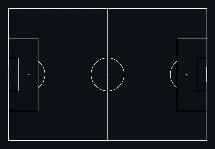
Now, let's turn our attention to the main highlight of this discussion - plotting sonars. We will color triangles using a three-degree scale. For each player in the starting eleven, we will examine their twenty pass bins and visualize the corresponding sonar segments. By utilizing integer values for the bins, we can effortlessly determine both the starting and ending angles for each segment by multiplying (360°/20) by the bin number (where 20 denotes the total number of bins).
for player in startingXI: for _, row in sonar_df[sonar_df.player == player].iterrows(): degree_left_start = 198 color = "gold" if row.amount < 3 else "darkorange" if row.amount < 5 else '#9f1b1e' n_bins = 20 degree_left = degree_left_start +(360 / n_bins) * (row.angle_bin) degree_right = degree_left - (360 / n_bins) pass_wedge = pat.Wedge( center=(row.x, row.y), r=row.length*0.16, # scaling the sonar segments theta1=degree_right, theta2=degree_left, facecolor=color, edgecolor="black", alpha=0.6 ) ax.add_patch(pass_wedge)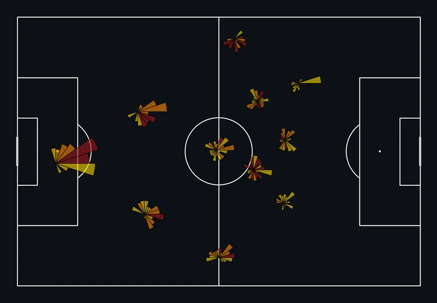
Finally, we need to clarify which players each sonar represents. Instead of labeling them with the full names like Lionel Andrés Messi Cuccittini, we can simply associate them with the shorter names that are more familiar to us.
barcelona_dict = { 'Andrés Iniesta Luján': 'Andrés Iniesta', 'Carles Puyol i Saforcada': 'Carles Puyol', 'Gerard Piqué Bernabéu': 'Gerard Piqué', 'Gnégnéri Yaya Touré': 'Yaya Touré', 'Lionel Andrés Messi Cuccittini': 'Lionel Messi', "Samuel Eto''o Fils": "Samuel Eto'o", 'Sergio Busquets i Burgos': 'Sergio Busquets', 'Seydou Kéita': 'Seydou Kéita', 'Sylvio Mendes Campos Junior': 'Sylvinho', 'Thierry Henry': 'Thierry Henry', 'Víctor Valdés Arribas': 'Víctor Valdés', 'Xavier Hernández Creus': 'Xavi', } for _, row in average_location.iterrows(): if row.name in startingXI: annotation_text = barcelona_dict[row.name] pitch.annotate( annotation_text, xy=(row.x, row.y-4.5), c='white', va='center', ha='center', size=9, fontweight='bold', ax=ax ) ax.set_title( f"Barcelona vs Manchester United: Champions League 2008/2009 Final\nPassing Sonars for Barcelona (starting XI)", fontsize=18, color="w", fontfamily="Monospace", fontweight='bold', pad=-8 ) pitch.annotate( text='Sonar length corresponds to average pass length\nSonar color corresponds to pass frequency (dark = more)', xy=(0.5, 0.01), xycoords='axes fraction', fontsize=10, color='white', ha='center', va='center', fontfamily="Monospace", ax=ax )Below is a comprehensive code encapsulated within a universal function:
from statsbombpy import sb import pandas as pd import numpy as np from mplsoccer import Pitch import matplotlib.pyplot as plt import matplotlib.patches as pat def passing_sonar(MATCH_ID, TEAM): passes = sb.events(match_id=MATCH_ID, split=True, flatten_attrs=False)["passes"] passes = passes[passes['team']==TEAM] df = passes[['pass', 'player']] df['angle'] = [df['pass'][i]['angle'] for i in df.index] df['length'] = [df['pass'][i]['length'] for i in df.index] df['angle_bin'] = pd.cut( df['angle'], bins=np.linspace(-np.pi,np.pi,21), labels=False, include_lowest=True ) sonar_df = df.groupby(["player", "angle_bin"], as_index=False) sonar_df = sonar_df.agg({"length": "mean"}) pass_amt = df.groupby(['player', 'angle_bin']).size().to_frame(name = 'amount').reset_index() sonar_df = pd.concat([sonar_df, pass_amt["amount"]], axis=1) passes["x"], passes["y"] = zip(*passes["location"]) average_location = passes.groupby('player').agg({'x': ['mean'], 'y': ['mean']}) average_location.columns = ['x', 'y'] sonar_df = sonar_df.merge(average_location, left_on="player", right_index=True) lineups = sb.lineups(match_id=MATCH_ID)[TEAM] lineups['starter'] = [ lineups['positions'][i][0]['start_reason']=='Starting XI' if lineups['positions'][i]!=[] else None for i in range(len(lineups)) ] lineups = lineups[lineups["starter"]==True] startingXI =lineups['player_name'].to_list() sonar_df = sonar_df[sonar_df['player'].isin(startingXI)] fig ,ax = plt.subplots(figsize=(13, 8),constrained_layout=False, tight_layout=True) fig.set_facecolor('#0e1117') ax.patch.set_facecolor('#0e1117') pitch = Pitch(pitch_type='statsbomb', pitch_color='#0e1117', line_color='#c7d5cc') pitch.draw(ax=ax) for player in startingXI: for _, row in sonar_df[sonar_df.player == player].iterrows(): degree_left_start = 198 color = "gold" if row.amount < 3 else "darkorange" if row.amount < 5 else '#9f1b1e' n_bins = 20 degree_left = degree_left_start +(360 / n_bins) * (row.angle_bin) degree_right = degree_left - (360 / n_bins) pass_wedge = pat.Wedge( center=(row.x, row.y), r=row.length*0.16, theta1=degree_right, theta2=degree_left, facecolor=color, edgecolor="black", alpha=0.6 ) ax.add_patch(pass_wedge) for _, row in average_location.iterrows(): if row.name in startingXI: annotation_text = row.name pitch.annotate( annotation_text, xy=(row.x, row.y-4.5), c='white', va='center', ha='center', size=9, fontweight='bold', ax=ax ) pitch.annotate( text='Sonar length corresponds to average pass length\nSonar color corresponds to pass frequency (dark = more)', xy=(0.5, 0.01), xycoords='axes fraction', fontsize=10, color='white', ha='center', va='center', fontfamily="Monospace", ax=ax ) return figThank you for taking the time to read my article. I would greatly appreciate any feedback you may have. If you're interested in more football-related content, feel free to check out my Twitter/X account.
References
Creating Passing Sonars in Python
In this data analysis piece on the Women's World Cup 2019, we'll look at how to create passing sonars from Statsbomb data using the France ...
Source: Total Football AnalysisA Comprehensive Guide to Passing Sonars Visualization in Python
This article delves into football analytics, focusing on the powerful visualization of passing sonars using Python, which can significantly ...
Source: futsalua.orgPassing Sonars Football Viz in Python: Full Walkthrough | by Aleks Kapich
In this post, I'm going to walk through the steps necessary for creating passing sonars visualization, the same as displayed above.
Source: MediumPassSonar: Visualizing Player Interactions in Soccer Analytics
The most important trait in these pass sonars is the radial bar. As it would be in simple bar charts, they represent the pass angle frequency.
Source: MediumA Sneak Peak at IQ Tactics + A Brief History of Radials/Sonars/Wagon ...
Obviously football is played on a rectangular pitch ... So these are seasonal sonars for passes made by Manchester City and Cardiff City.
Source: StatsBombThe Innovation of the Players Orientation widget
Pass sonars, radials, wagon wheels… These are just some of the names ... The answer is that plotting an entire football team's passes ...
Source: FootovisionBen Griffis – Football Analytics & Visualization
Passing sonars offer a lot of information about a player's passes at one time. We can see the average directions players passed in (the orientation of the bars) ...
Source: Ben GriffisfPlotSonar: A passing sonar alternative to popularly used versions
A passing sonar alternative to popularly used versions. Description. Think of the chart as a bunch of concentric rings. Each ring captures passes falling ...
Source: rdrr.io
 ALL
ALL sports
Discussions